KPI Trees
How to align with leadership on actionable metrics
Many organizations focus on output (we need this feature) and very high-level metrics (revenue, paying customers, active users, etc.) But both perspectives are not very helpful for a product team.
As we know, concentrating on output has many problems. I don’t want to get deep into this topic—only a few words. If we focus on output, we don't know if people will even use the features we create. And if they are using them if the new features really lead to business success. Another symptom connected to output focus is an endless stream of feature ideas, which leads to massive backlog syndrome and constant context switching.
Let's look at high-level metrics. I'm pretty sure that even if your organization is not focused on data, at least senior leadership will have a couple of core KPIs on top of their mind. And this is understandable. Without measuring revenue, profit, and cost, running a business is impossible.
Which KPIs are in focus heavily depends on the business you are in. Often, it will be some form of revenue metric (ARR, MRR, ARPU, etc.) and second-level indicators connected to customers and users (DAU, MAU, conversion rates, session time, etc.)
You might already have been in an uncomfortable situation where a leader asks your team to think more about increasing revenue or getting more users into the product. Usually, this is not very actionable for a team. Influencing revenue is quite abstract, or creating a new feature and directly seeing an impact on user numbers is very unlikely.
This is why these metrics are called lagging indicators. They move slowly and are hard to influence directly. Teams are capable of influencing metrics on a detailed level, directly connected to concrete user actions. These metrics are called leading indicators.
A KPI Tree is a mapping method to connect these leading and lagging indicators. We can start with a high-level indicator, like revenue, and break it down into indicators the team can directly influence.
KPI Trees visualize the connection between different indicator levels. Let’s look at an example of an appointment booking service (like calendly, cal.com, …).
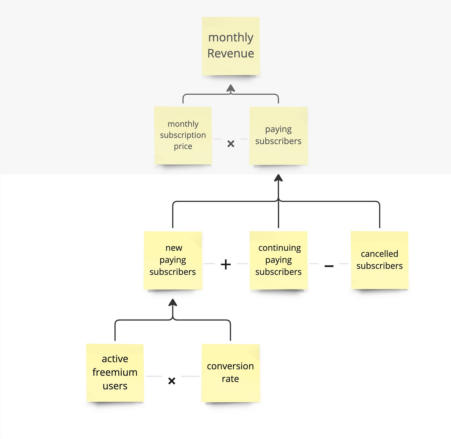
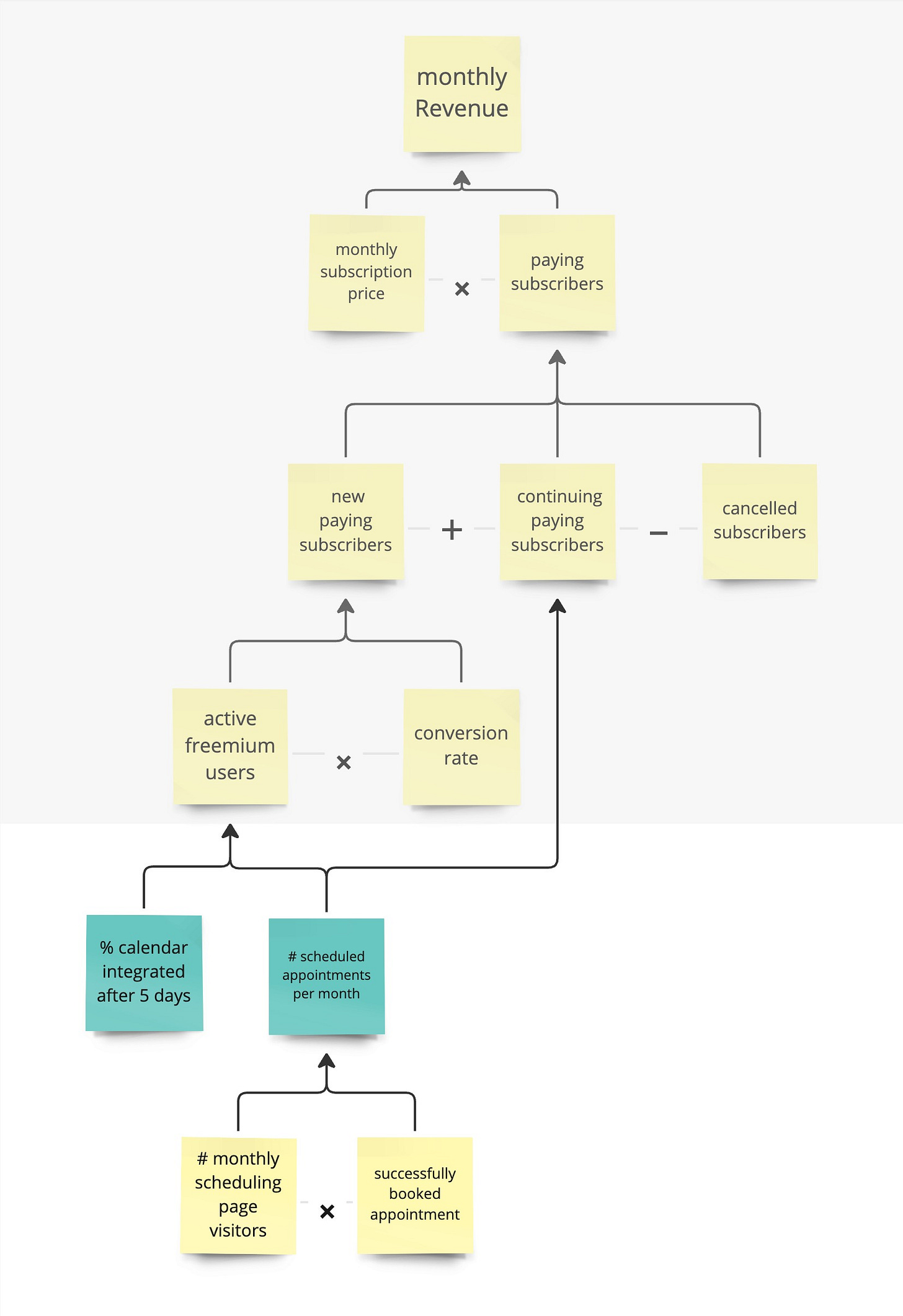
The business focuses on monthly revenue. The two factors driving monthly revenue are the subscription price multiplied by the number of paying subscribers. In the tree, we are starting to build out our model.
Paying subscribers can be decomposed into new subscribers plus continuing minus canceled ones. Further unpacking new paying subscribers, we see active freemium subscribers multiplied by the conversion rate. This model already gives us a better idea of where the leverage points are. With this model at hand, you can start a discussion if you want to focus on decreasing cancellations or getting more new paying subscribers. Looking at the factors for new subscribers, you can influence how many active freemium subscribers you have or how many convert.
While further unpacking, we will discover assumptions. Causation is not fully given. These assumptions can be based on what we see in our data or even can simply be our pure assumptions.
For this example, we assume that the main indicators for active freemium users are people who integrated their calendar within the first 5 days after sign-up and the number of scheduled appointments per month. The number of scheduled appointments also indicates if people are continuing their subscriptions. This might be a great metric to focus on because it has leverage on multiple indicators. To increase the number of scheduled appointments, we could influence the number of scheduling page visitors and the ratio of successfully booked appointments.
As you see, we unpacked monthly revenue down to multiple actionable factors. For example, increasing the number of successful schedules on the booking page. You can imagine giving a team this indicator to improve. They could investigate what stops people from booking on the page and test hypotheses on getting more successful bookings.
Of course, this tree could focus on a completely different route. We could have focused on decreasing cancellations to see which factors influence the cancellations. When using KPI Trees, building all aspects of the tree out doesn't make sense. Go deeper into the areas that fit your identified problems along with your product strategy.
The big side benefit of KPI Trees is to visualize how you think your model works. While creating or discussing a model in a group, you might find out that there are different interpretations of how your model works. Making these different views on the model apparent is helpful to align on one shared model. If there are different opinions and nobody has evidence, it would be a great opportunity to look closer into your data or build up your metric collection around this area.
KPI Trees help you to discuss which actionable indicator your team should focus on. It is a great way to steer the discussion away from feature requests to how to influence the factor your organization is interested in. With a shared metric causality, every time you get approached with a new idea, you can discuss which indicator gets influenced and if this is currently where you want to focus.
To get deeper into KPI Trees, Shaun Russell & Petra Wille wrote an excellent article. And Matt O’Connell (vistaly) extended to goals and counter metrics.
KPI Trees are easy to create. To get started, simply look at what you are currently working on and ask yourself, “What user behavior is this feature influencing, and what is the path to the high-level indicators?”


